Humon Muscle Oxygen Zones and Integration with TrainingPeaks
As requested by many of you, the Humon zones are now incorporated into the FIT file generated when using the Humon IQ data fields, allowing you to take this data with you and import it into other training platforms. You can download the latest Humon IQ data fields that include the zones (version 2.1.0+) following the links below.
WKO4 Custom Chart Packs by TrainingPeaks
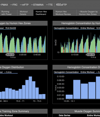
We also teamed up with TrainingPeaks to build custom Humon chart packs in WKO4 to further enhance the analysis of your workout. In the WKO4 chart library, you will be able to find a single athlete Humon dashboard and three workout level packs. The following screenshot from WKO4 is what you will see when first opening a workout with the Humon Hex Dashboard chart pack.
The Humon Hex Dashboard
The Humon Hex dashboard shown above provides an overview of all of the muscle oxygen data collected by the Hex. In total, there are 14 different charts on the dashboard to analyze the muscle oxygen data. This article will cover the key charts when importing your Humon data to WKO4.
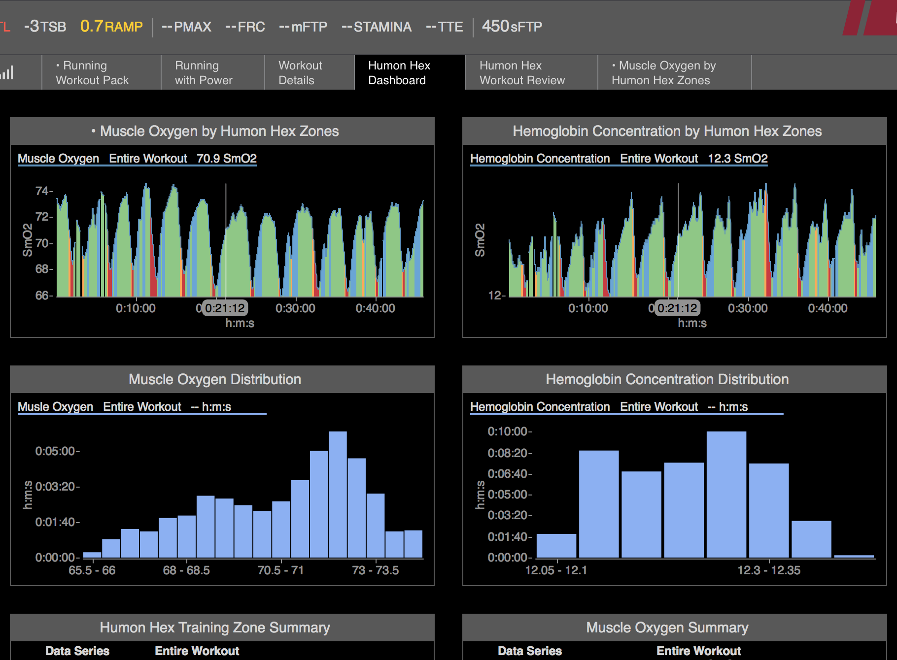
The first two charts display the SmO2 % and hemoglobin concentration with the Humon training zones similar to the Humon apps. From these charts an athlete can analyze the workout as a whole. For example, many athletes we’ve spoken to have found that they are not warming up properly, decreasing their performance and increasing the chance for injury. Using the chart below you can see when the warm-up is complete by monitoring SmO2 % during the first few intervals.
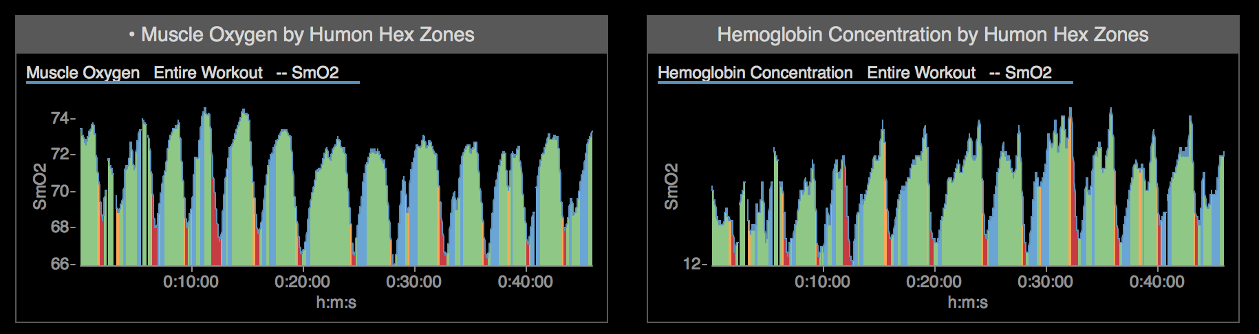
The Humon Hex Training Zone and Muscle Oxygen Summary give the raw numbers that are also contained in some of the other charts. From these charts you can see the the exact amount of time spent in each zone, as well as the average, minimum, and maximum SmO2 % reached during the workout. Having these summary charts provide insights on the overall intensity and fatigue level during the workout. The following Humon Hex Training Zone chart provide a visual summary of this information.
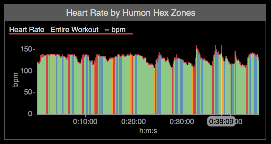
If you train with a power meter or heart rate monitor, the Power and Heart Rate by Humon Hex Zone charts show an overly of these metrics with the Humon zone information. These graphs allow you to identify differences between output (power) and how your muscles are responding. There are also many insights you can get when comparing heart rate to muscle oxygen.
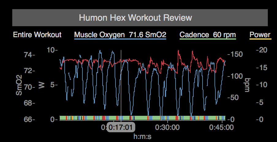
The final chart in the dashboard, the Humon Hex Workout Review, provides an entire workout review so that you can compare all of your data collected on a single graph. Seeing all of your data overlaid in one place gives you the ability to pick out correlations and features that aren’t necessarily obvious from the more simple charts above. The Hex zones are plotted in a small bar along the bottom, so you can still see the zones, without obscuring the rest of the data.
Thanks for reading and make sure to check out @behumon on Instagram, Twitter, and Facebook for more tips on how to warm-up, train, and recover effectively.